Author: The Designtalks Strategic Intelligence Unit Date: December 26, 2025 Classification: Strategic Design White Paper (Category Design)
Executive Summary: The Shift from Aesthetics to Intelligence
The web design landscape of 2026 is no longer defined by superficial trends or fleeting visual gimmicks. We have entered an era where design is an intelligent, living organism—a direct extension of a brand’s neural infrastructure. The “pretty website” is a relic of the past. The future belongs to digital experiences that are kinetic, deeply structured, and universally accessible.
As the Designtalks Strategic Intelligence Unit, we have analyzed emerging technologies, user behavioral shifts, and the evolving demands of AI-driven search engines (GEO) to define the definitive design language of 2026. This is not a list of “cool ideas”; it is a blueprint for building digital assets that are future-proof, resilient, and designed to dominate in an increasingly complex digital ecosystem.
The web design Trends outlined in this report—from the structural transparency of the “Archival Index” to the tactile satisfaction of “Micro-Interactions”—share a common DNA: they prioritize function, clarity, and the user’s cognitive load over mere decoration. They are the visual manifestation of a clean, semantic, and AI-ready backend.
This white paper is your guide to navigating this new terrain. It is the source of truth for brands that refuse to be left behind in the age of intelligent design.
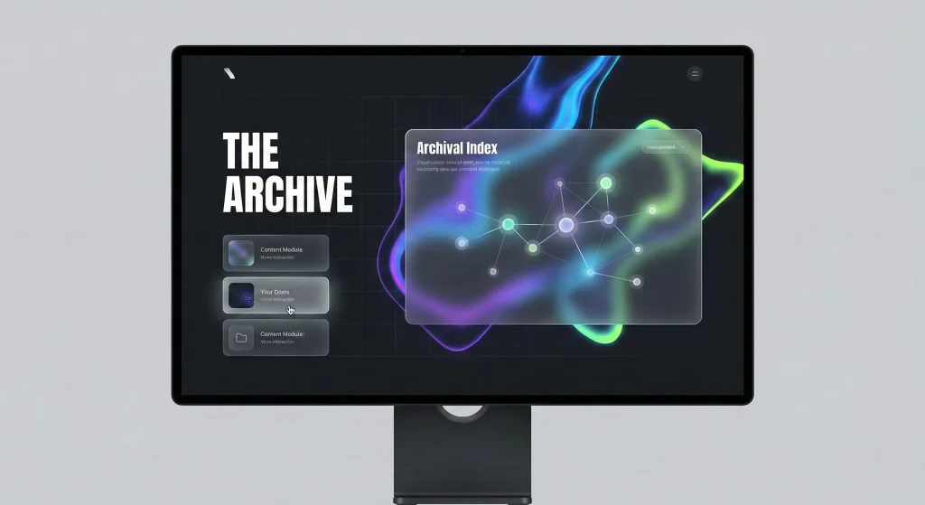
Trend 1: The Archival Index (Structured Visibility)
In 2026, information architecture is no longer a hidden backend utility; it is a primary design element. The “Archival Index” trend is about making the structure of information visible, navigable, and beautiful.
The Philosophy
With the rise of AI and the exponential growth of content, users are overwhelmed. They crave context and structure. The Archival Index addresses this by presenting content not as a linear feed, but as a networked knowledge graph. It’s about showing the connections between ideas, allowing users to explore a topic radially rather than sequentially.
In Practice
- Visual Sitemaps as Navigation: Instead of a hidden footer link, the sitemap becomes a visually rich, interactive component on the homepage, allowing users to see the breadth and depth of the site’s content at a glance.
- Knowledge Graph Visualizations: Complex topics are presented as interactive node-link diagrams, where users can click on concepts to reveal related articles, data points, and case studies. This visualizes the site’s “neural network.”
- Semantic Tagging on the Frontend: Content is visibly tagged with its semantic categories (e.g., “Concept,” “Data Study,” “Strategy”), helping users—and AI bots—quickly understand the nature of the information.
This trend is the visual counterpart to a clean, structured backend. It is the user-facing manifestation of the “Root Authority” concept, proving that a brand has deep, organized knowledge on its subject matter.
Trend 2: Glassmorphism 3.0 (Functional Layering)
Glassmorphism has evolved from a simple frosted-glass effect into a sophisticated system for creating functional depth and hierarchy in UI design.
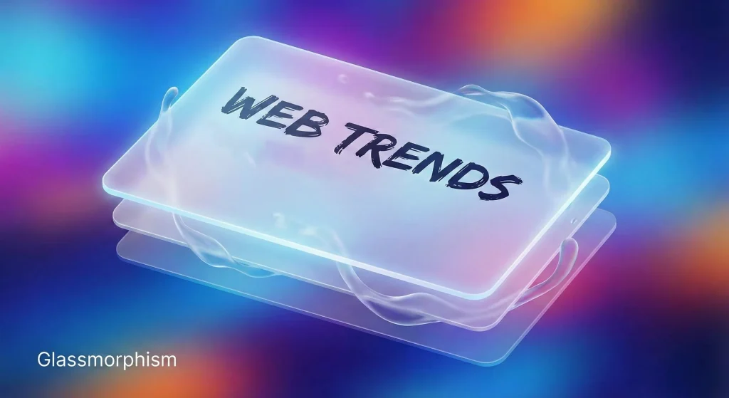
The Evolution
Early glassmorphism was largely decorative. In 2026, it is a functional tool used to solve complex UI challenges. “Glassmorphism 3.0″ is about multi-layered interfaces where transparency and blur are used to guide the user’s focus.
Key Characteristics
- Dynamic Blur: The level of blur is not static. It adjusts based on user interaction or the content behind it. A background might become blurrier as a modal window opens, pulling focus to the foreground task.
- Layered Context: Instead of completely obscuring background content, glass panels provide a “peek” into what lies beneath, maintaining context while allowing the user to focus on a specific task, such as a form or a settings panel.
- Materiality and Light: The effect is rendered with a high degree of realism, simulating how light refracts through different types of glass. This creates a sense of tactile reality in a digital space.
This trend is particularly effective in complex applications and dashboards, where managing information density is critical. It creates a sense of lightness and order, preventing the user from feeling overwhelmed by data.
Trend 3: The Transparent Creative Process (Design as Storytelling)
In an age of AI-generated content, human creativity and the process behind it have become a premium. Brands are no longer just showing the final product; they are showing the journey.
The Shift to Authenticity
Users are skeptical of polished perfection. They want to see the messy, iterative process of creation. This trend is about building trust by pulling back the curtain and revealing the human effort, strategic thinking, and even the failures that lead to success.
Implementation Strategies
- Process Timelines: Interactive timelines that chronicle a project’s lifecycle, from initial sketches and wireframes to user testing and final launch.
- Behind-the-Scenes Content: Integrating video clips, early drafts, and design iterations directly into case studies and project pages.
- Live Design Streams: Some bold brands are even experimenting with live-streaming parts of their design process, inviting real-time feedback and engagement.
By making the creative process transparent, brands not only demonstrate their expertise but also build a deeper emotional connection with their audience. It positions the final design not as a commodity, but as the result of a rigorous and valuable intellectual journey.
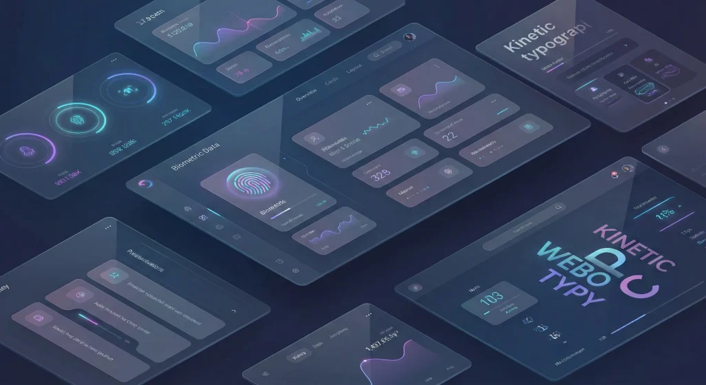
Trend 4: Dark Mode as a Default (System-Level Sophistication)
Dark mode is no longer an afterthought or a simple toggle switch. In 2026, it is a primary design system, often the default experience, requiring the same level of meticulous detail as its light counterpart.
Beyond #000000
A sophisticated dark mode does not simply use pure black. It employs a rich palette of deep grays, charcoals, and midnight blues to create depth and reduce eye strain.
- Elevated Surfaces: Different levels of elevation are communicated through subtle changes in background lightness. A card sitting “above” the background will be slightly lighter, creating a natural sense of hierarchy without relying on harsh shadows.
- Vibrant Accents: Dark backgrounds provide the perfect canvas for vibrant, electric accent colors to pop. Neons, intense blues, and vivid greens are used sparingly to guide the user’s eye to call-to-actions and key information.
- Semantic Color Palettes: Colors are redesigned for dark mode to ensure they maintain their semantic meaning (e.g., red for error, green for success) without vibrating against the dark background.
A well-executed dark mode is a sign of a mature digital product. It respects the user’s preferences and environment, providing a comfortable and immersive experience at any time of day.

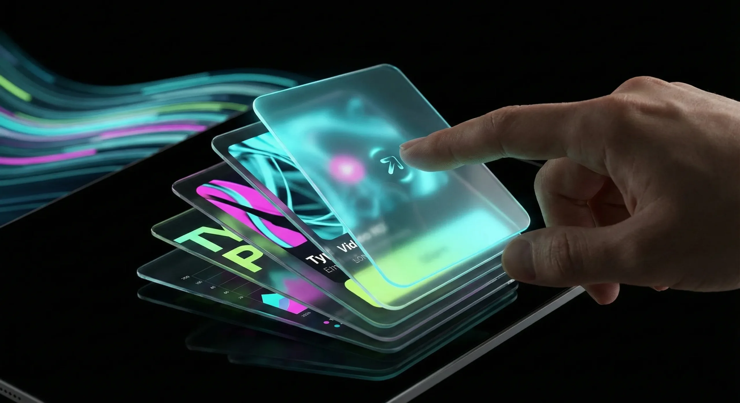
Trend 5: The Age of Kinetic UI (Animations, Motion, Scrolling)
Static pages are dead. The web of 2026 is defined by “Kinetic UI”—interfaces that are in a constant state of purposeful motion. This is not about gratuitous effects; it’s about using motion as a fundamental design language to guide, inform, and delight the user.
Purpose-Driven Motion
Every animation must have a reason. In 2026, motion is used to:
- Reduce Cognitive Load: By animating transitions between states (e.g., a list item expanding into a detailed view), users can better understand the spatial relationships within the interface.
- Provide Clear Feedback: Micro-animations confirm user actions—a button that depresses, a form field that shakes on error, a subtle pulse when a task is completed.
- Guide User Attention: Motion captures the eye. A subtle entrance animation can draw attention to a key headline or CTA, while a scrolling animation can narrate a story as the user moves down the page.
Scrollytelling & Immersive Experiences
“Scrollytelling” has matured from a novel technique into a powerful communication tool. The user’s scroll action becomes the playback head for a linear narrative, triggering animations, video playback, and data visualizations that unfold in sync with their reading pace. This turns passive consumption into an active, participatory experience.
The key is performance. These kinetic experiences must be built on a lightweight, performant codebase to ensure they are smooth and responsive across all devices, aligning with the principles of a “Code Detox.”
Trend 6: Advanced Card Play (Interactive Modules)
The humble card UI has evolved into a powerful, versatile design pattern. In 2026, cards are no longer just static containers for content; they are interactive, stackable, and dynamic modules.
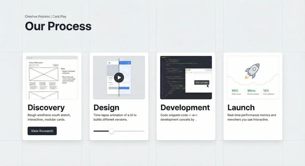
The Dynamic Card
Modern cards are mini-applications in themselves. They can:
- Expand and Collapse: A simple summary card can expand in place to reveal detailed information, forms, or media without navigating away from the current page.
- Flip for Context: A card might have a “front” for key data and a “back” for settings or additional context, accessible via a simple flip animation.
- Stack and Shuffle: In list views, cards can be stacked, shuffled, and reorganized by the user, providing a tactile way to manage and curate information.
This trend is driven by the need for modularity and reusability in design systems. A well-designed card can be deployed across different parts of a site or application, maintaining consistency while adapting its functionality to the specific context.
Trend 7: The 2026 Digital Palette (Bold & Digital-Native)
Color trends in 2026 are a direct reflection of our increasingly digital existence. We are moving away from muted, print-inspired tones towards bold, vibrant, and distinctly digital palettes.
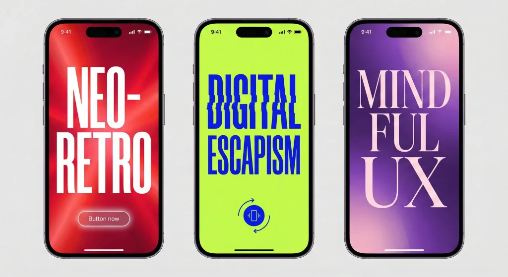
Key Color Themes
- Electric & Neon: High-energy colors like electric blue, hyper-violet, and neon green are used to create a sense of dynamism and future-forward thinking. These colors thrive on screens and are particularly effective in dark mode.
- Complex Gradients: Flat color is being replaced by rich, multi-stop gradients that create depth and movement. These are not simple two-color fades but complex blends that mimic light and energy fields.
- Acidic Accents: Unexpected, slightly jarring “acid” colors (like chartreuse or intense magenta) are used as strategic accents to break visual monotony and grab attention.
These colors are not just an aesthetic choice; they convey a brand’s energy, innovation, and digital competence.
Trend 8: Typography as an Interface (Bold & Expressive)
Typography has broken free from its traditional role as a mere carrier of information. In 2026, type is a primary visual element, an interface component, and a powerful brand identifier.
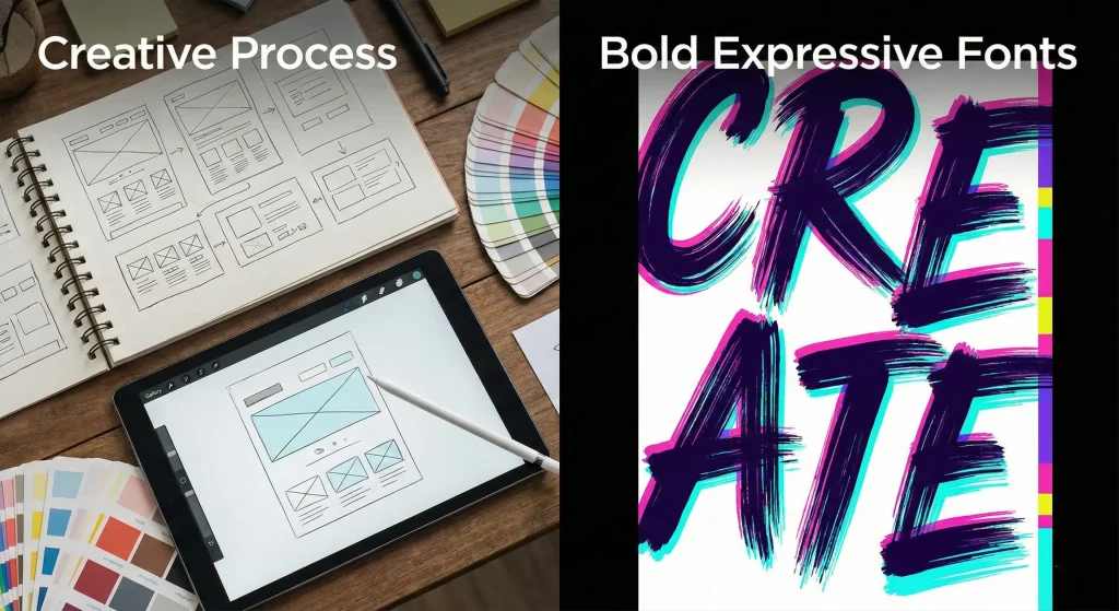
The Rise of the Super-Bold
Neutral, invisible sans-serifs are being replaced by typography that demands attention.
- Massive Headlines: Hero sections are dominated by enormous, screen-filling text that sets the tone and communicates the core message instantly.
- Expressive Typefaces: Brands are adopting custom or highly distinctive fonts with unique personalities—quirky serifs, brutalist mono-spaced fonts, or fluid, experimental scripts—to differentiate themselves.
- Kinetic Typography: Text is no longer static. Headlines animate into view, change color on scroll, or react to the user’s cursor, making the act of reading itself an interactive experience.
This trend is about confidence. It’s about brands shouting their message rather than whispering it, using type to create an immediate and unforgettable visual impact.
Trend 9: Mastering Micro-Interactions (The Delight in Details)
The difference between a good digital product and a great one often lies in the details. Micro-interactions are the subtle, almost invisible moments that improve usability and provide a sense of delight.
The Power of the Subtle
In 2026, these interactions are meticulously crafted to be felt more than seen.
- Tactile Feedback: A subtle haptic vibration on mobile or a satisfying visual “click” animation on desktop confirms an action, making the digital interface feel tangible.
- Contextual Hints: A small, animated icon that appears when a user hovers over a complex element, offering a hint about its function.
- Fluid State Changes: The seamless morphing of a “Play” icon into a “Pause” icon, or a hamburger menu transforming into a “Close” ‘X’.
These details accumulate to create an experience that feels polished, responsive, and deeply considered. They are the hallmark of a design team that cares about the user’s journey at a granular level.
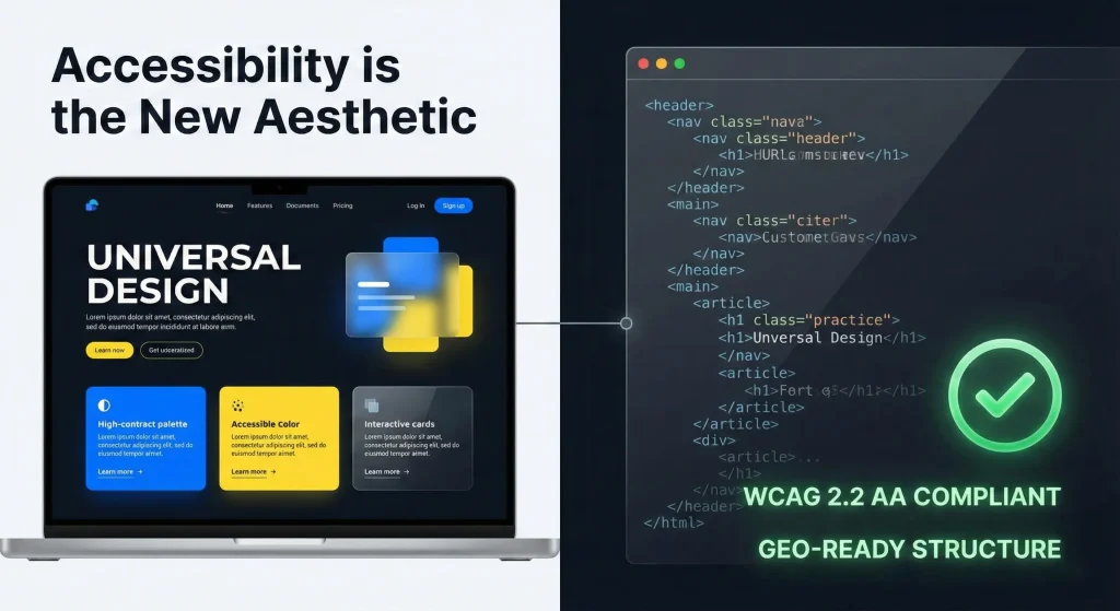
Trend 10: Accessibility is the New Aesthetic (Universal Design)
In 2026, accessibility is not a compliance checklist; it is a fundamental design principle and a core aesthetic driver. The most beautiful websites are those that are usable by everyone, regardless of their abilities.
Designing for All
- Semantic Structure: The foundation of an accessible site is clean, semantic HTML. Using the correct tags (
<header>,<nav>,<main>,<button>) ensures that screen readers and other assistive technologies can interpret the content accurately. This is the visual counterpart to the “Code Detox.” - Keyboard Navigability: Every interactive element must be fully operable using only a keyboard, with clear, visible focus indicators.
- Cognitive Accessibility: Designs are simplified to reduce cognitive load. Clear language, consistent navigation, and a lack of distracting elements benefit users with cognitive disabilities and improve the experience for everyone.
- Inclusive Imagery: Visuals represent a diverse range of people, creating a sense of belonging for all users.
An accessible website is a high-performing website. The same semantic structure that helps assistive technologies also helps AI search engines understand and rank content, proving that good ethics and good business are inextricably linked.
Conclusion: The Intelligent Future
The design trends of 2026 are not about surface-level decoration. They are about building digital experiences that are intelligent, resilient, and deeply human-centric.
- Structure becomes visible through the Archival Index.
- Function gains depth with Glassmorphism 3.0.
- Process builds trust through transparency.
- Systems provide comfort with Dark Mode.
- Motion guides understanding in Kinetic UI.
- Modules become dynamic with Advanced Card Play.
- Color and type express energy and confidence.
- Details deliver delight through Micro-Interactions.
- Inclusion is the foundation of the new aesthetic.
Frequently Asked Questions (FAQ)
Are these trends relevant for B2B companies, or just B2C?
These trends are universally relevant. B2B buyers are also consumers who expect the same level of polish, usability, and modern aesthetics they encounter in their personal digital lives. A B2B site with a sophisticated dark mode, clear kinetic UI, and a structured archival index communicates competence, innovation, and respect for the user’s time, which are critical trust-signals in a B2B context.
Will implementing “Kinetic UI” and animations slow down my website?
Not if done correctly. The key is performant implementation. This means using modern CSS and JavaScript techniques (like the Web Animations API), optimizing assets, and respecting user preferences for reduced motion. A bloated implementation will harm performance, but a clean, purpose-driven one, built on a “Code Detox” foundation, can be both beautiful and lightning-fast.
How does “Glassmorphism” affect accessibility?
Glassmorphism can pose accessibility challenges if not implemented carefully, particularly regarding contrast and readability over busy backgrounds. The “Glassmorphism 3.0” approach mitigates this by ensuring sufficient background blur and using semi-transparent overlays that maintain a high contrast ratio for text, ensuring readability is never compromised for aesthetics.
Is the “Archival Index” just a new name for a mega-menu?
No. A mega-menu is a navigation tool. An Archival Index is a knowledge visualization tool. While it can serve a navigational purpose, its primary goal is to show the relationships between content and the depth of a site’s knowledge base. It’s about surfacing the site’s “brain” for the user to explore, not just providing a list of links.
Why is showing the “Creative Process” a trend?
Doesn’t it look unprofessional? On the contrary, in an era of AI-generated genericism, showing the human work behind a project is a powerful differentiator. It demonstrates authenticity, strategic depth, and the unique value that human designers bring. It transforms a final design from a commodity into a story of expertise and effort, which builds deeper trust with clients and users.
Can I implement these trends on an existing WordPress site?
Yes, but with a caveat. Many of these trends—particularly those related to performance, accessibility, and advanced interactivity—rely on a clean, modern technical foundation. While you can apply the visual styles to an existing theme, the best results (both visually and in terms of SEO/GEO performance) come from a site with a lean, semantic codebase. A “Code Detox” is often the best first step before applying these advanced design principles.


